
Streamloan | Responsive Web Redesign

About Streamloan
Streamloan makes it easier to apply for a mortgage by simplifying how home buyers submit documents and communicate with lenders.
The Challenge
Design a responsive web platform for Streamloan based on the existing native iOS application.
My Role: Design Lead
I led the project, managing the project timeline and a team of 11 designers. I was the primary liaison with the client.
“Stefanie quickly displayed a deep understanding of a complex process (applying for and managing a mortgage). She thought critically about the usability and architecture of the existing StreamLoan app, providing recommendations that show consideration for multiple personas - enterprise business and consumer borrower needs.
Stefanie is a thoughtful product designer, a strong manager, and a clear communicator. I would recommend to any team looking for a great designer and a fast learner.”
TL;DR
Streamloan's original product is a native iOS mobile app. Their customers loved the app, but many wanted to switch from mobile to desktop/tablet when sorting through documents. Our team was tasked with designing a responsive website that would work seamlessly between devices. We faced challenges with a short timeline, designing for a very complex process (mortgages), and ensuring consistency of work across a large team.
I co-lead the team, managed the project timeline, and liaised with Streamloan's CEO and head of design.
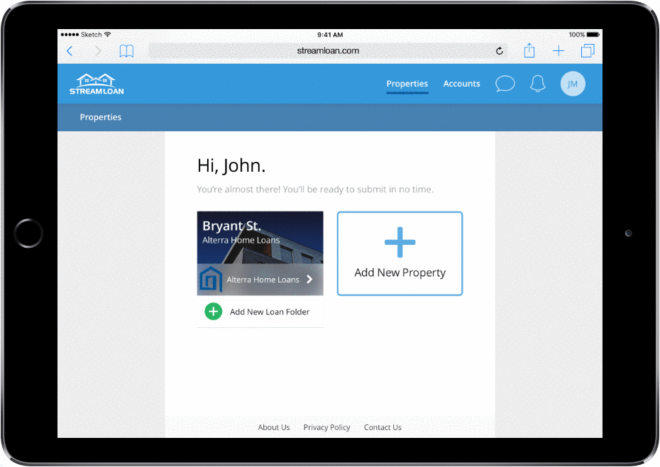
Check out our desktop/tablet prototype HERE. Or take a look at a sample of the work below:

Design Process
We used the design thinking framework from Stanford/IDEO to structure our 5.5 week design process.

In just over one month, the design team performed market research, ran UX and UI design sprints, created mobile and desktop prototypes, and tested comprehension and usability with users. This case study details each stage of this design process.
1. Empathize: Understanding the Mortgage Process
As anyone who has applied for a mortgage knows, the process is slow and complicated. Our team mapped a task flow of the traditional mortgage application process to understand the scope of the problem that home buyers face. Red boxes are pain points that Streamloan is targeting.
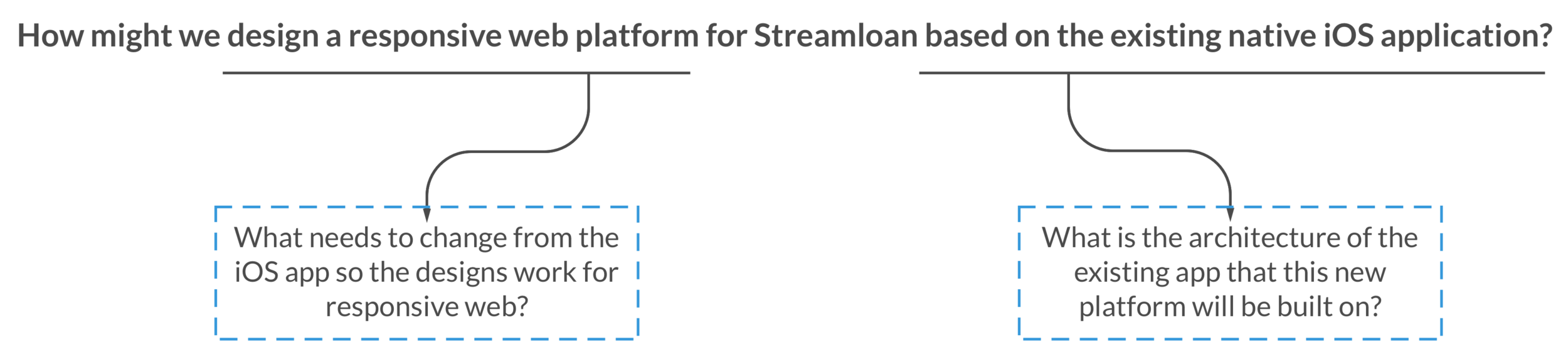
2. Define: Information Architecture & Responsive Web
Next, we set to work on defining our approach to answering this question: "How might we design a responsive web platform for Streamloan based on the existing native iOS application?" We broke the question into two parts:
Information Architecture
We navigated through the existing Streamloan app and identified 5 distinct sections (dark blue boxes). We sorted all the app's functions (light blue boxes) into one of these 5 sections. This map helped us make decisions about navigation later in the design process.

From Native iOS to Responsive Web
The team then identified design elements that would change when moving from native iOS to responsive web. This included navigation (previously a tab bar, which is not standard for responsive web) and designing on a grid.

2. Ideate: UX & UI Teams Diverge
Once we understood our task and the scope of the product, we split the team into two to divide and conquer the work. It worked well, then things got weird.

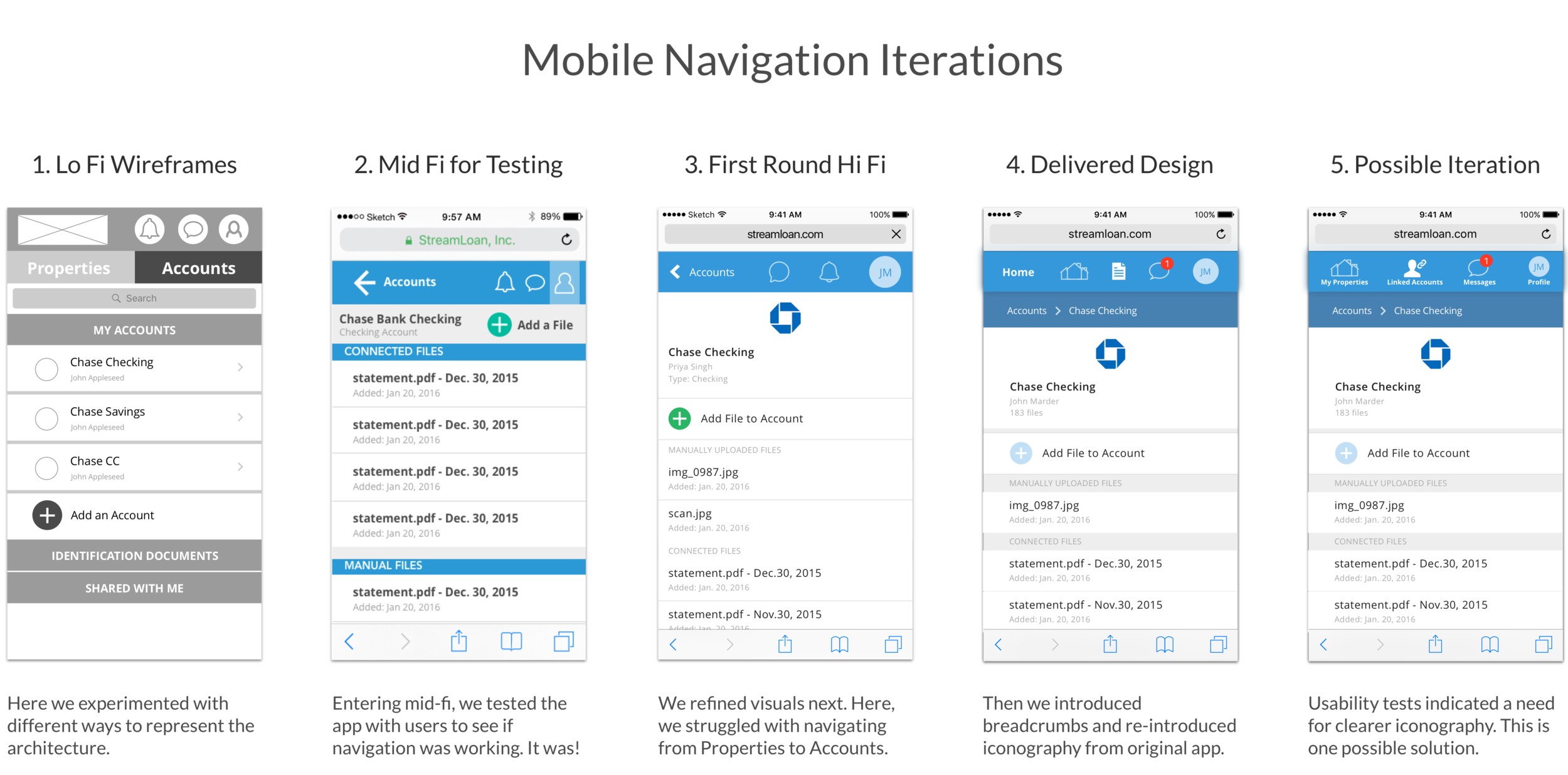
UX Team: Wireframing & Navigation
The UX team worked on clarifying the site architecture, ideating on navigation, and scaling up mobile designs into a desktop/tablet screen. One of the most notable challenges they faced was figuring out how navigation would work on mobile. Here is a snippet of their work:
UI Team: Streamloan's Brand & Atomic Design
The UI team explored Streamloan's style guide and the style of the existing app. Then, using Brad Frost's Atomic Design as a roadmap, we created foundational UI elements (e.g., button styles), progressively building up to page templates. Atomic Design helped us ensure that styles remained consistent, and it enabled the two teams to work in parallel.

Converge: Chaos Ensues
Our plan was to unite the two teams' work, using the UI team's elements and styles to "paint up" the UX team's wireframes. While this sort of worked, for the most part, our plans changed. C'est la vie!
We had a large team and a limited timeline, which made communication challenging. This meant that different people interpreted visual styles in different ways (damn creatives!), resulting in design inconsistencies across sections of the site. Thus, our designs went through several rounds of iteration before styles were consistent. It was tough, but we did ultimately create a product with a consistent visual language. YAS!
3. Prototyping: Hi Fi Screens & Interactions
Hi Fi Screens
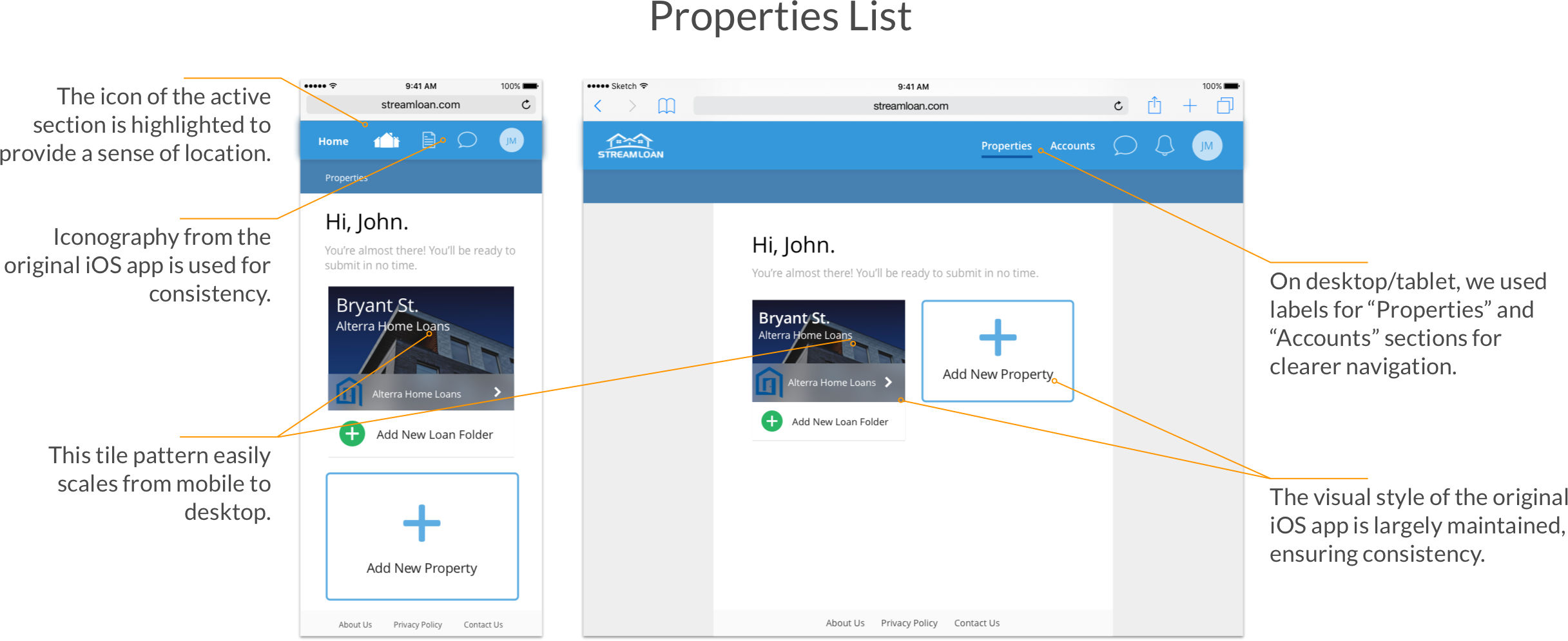
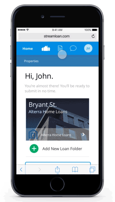
After many rounds of iteration and refinement, we had a set of high fidelity mockups for desktop and mobile. Here is a small sample:


4. Validation: Usability & Comprehension Testing
Usability & Comprehension Testing
We conducted usability tests to put our designs to the test with real users. We recruited 4 people to test on mobile and 5 to test on desktop. Testers had varying experience with mortgages; some had applied for or refinanced several mortgages, while others had never bought a home.

Results
While some testers struggled with the inherent difficulty of understanding mortgages, our prototypes performed well with target users (i.e., tech-savvy home-buyers). Here is a selection of our findings:

Final Deliverable
We delivered desktop and mobile mockups, clickable prototypes for desktop and mobile, and the raw results from our usability tests (i.e., videos and transcripts). Here is a zoomed-out view of the 100+ final screens we delivered.
Desktop Screens
Mobile Screens
Conclusion
Managing a team of 11 creative people was a difficult but very rewarding experience. I learned so much about leadership, designing in the constraints of an existing structure and brand, and how to apply structure to complexity. Things didn't always go as planned, but we rolled with the punches, and I'm so proud of the results.
Streamloan customers are excited about being able to complete their mortgage application wherever they feel most comfortable doing it, and the client was thrilled with the final product. The Streamloan team is implementing our designs now.
Testimonial
“Stefanie led a team of 11 designers in creating a responsive web version of StreamLoan’s existing native iOS app. Despite the short timeline and the large scope of this project, Stefanie and her team delivered a high-quality, brand-consistent product, which contributed towards the complete web design that is necessary to our team’s strategic growth.
Stefanie quickly displayed a deep understanding of a complex process (applying for and managing a mortgage). She thought critically about the usability and architecture of the existing StreamLoan app, providing recommendations that show consideration for multiple personas - enterprise business and consumer borrower needs.
Stefanie is a thoughtful product designer, a strong manager, and a clear communicator. I would recommend to any team looking for a great designer and a fast learner.”