
FutureAdvisor | Designing Investment Analysis

About FutureAdvisor
FA aims to create better financial outcomes for everyday families by partnering with banks and brokerages to provide robo-advising services to millions.
The Challenge
Design an on boarding experience that can convince ambivalent users that our product can improve their financial health.
My Role: Design Lead
I was the project's design lead, running the initial design sprint, managing the project timeline, and working with one additional designer.
TL;DR
We were challenged to design an onboarding flow that convinces investors that our product can help improve their financial situation. There are two main audiences for the experience: (1) financial advisors using the product to pitch to potential clients, and (2) potential clients who come here without a financial advisor.
In 9 weeks, we went from concept to production-ready specs for mobile and desktop.
Why does it matter to FutureAdvisor?
This is the product's pitch to potential clients. We have to explain and sell some really complex concepts in a digestible way. A lot of money is on the line!

Spoiler! Here's what we ended up designing.
Design Process
Our process resembles the "double diamond" design methodology... except we needed a few more diamonds to land on a successful solution. C'est la vie.

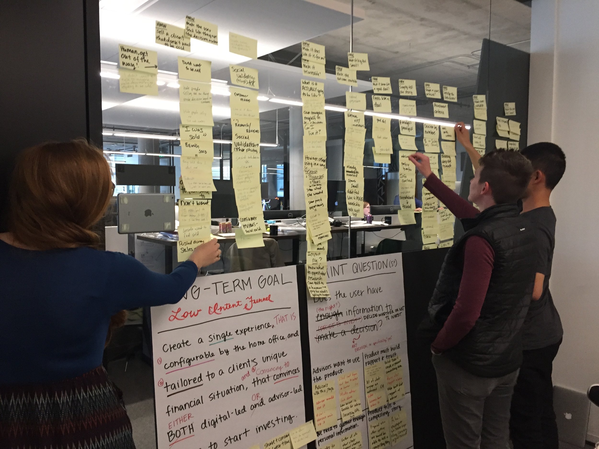
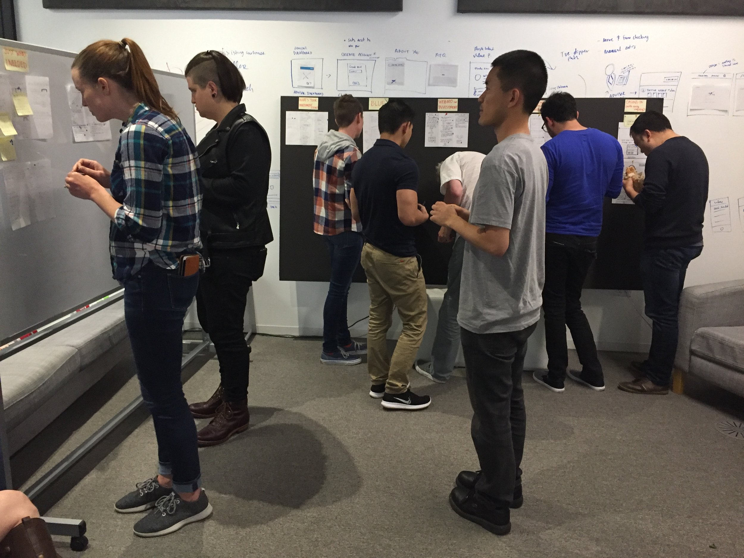
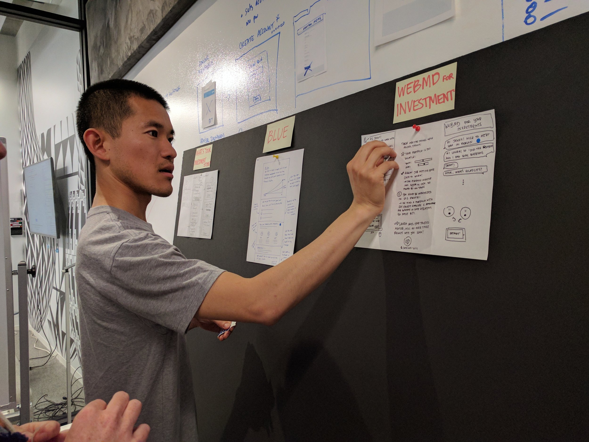
Design sprint
We started our work with a 3-day design sprint. You can learn more in this case study. Here are some highlights:
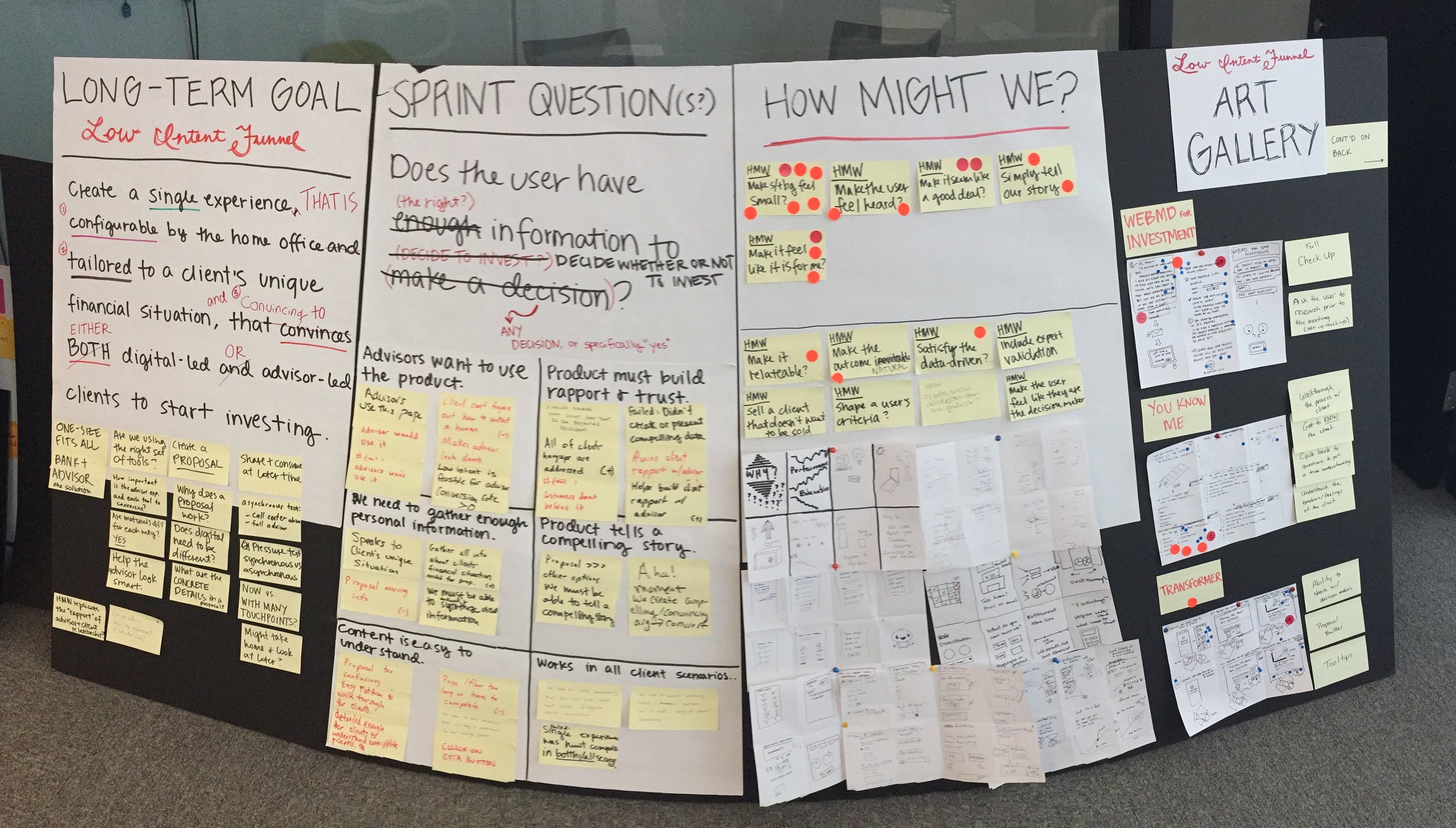
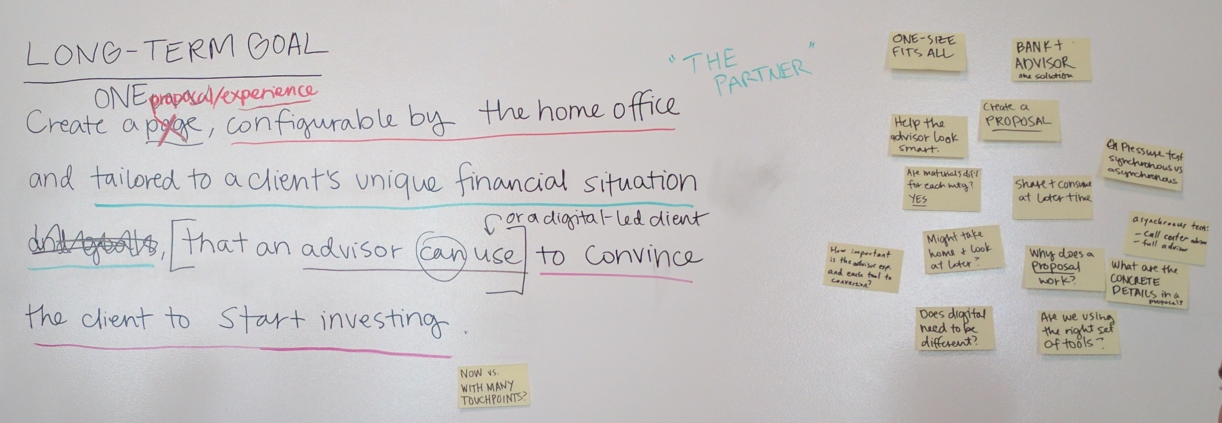
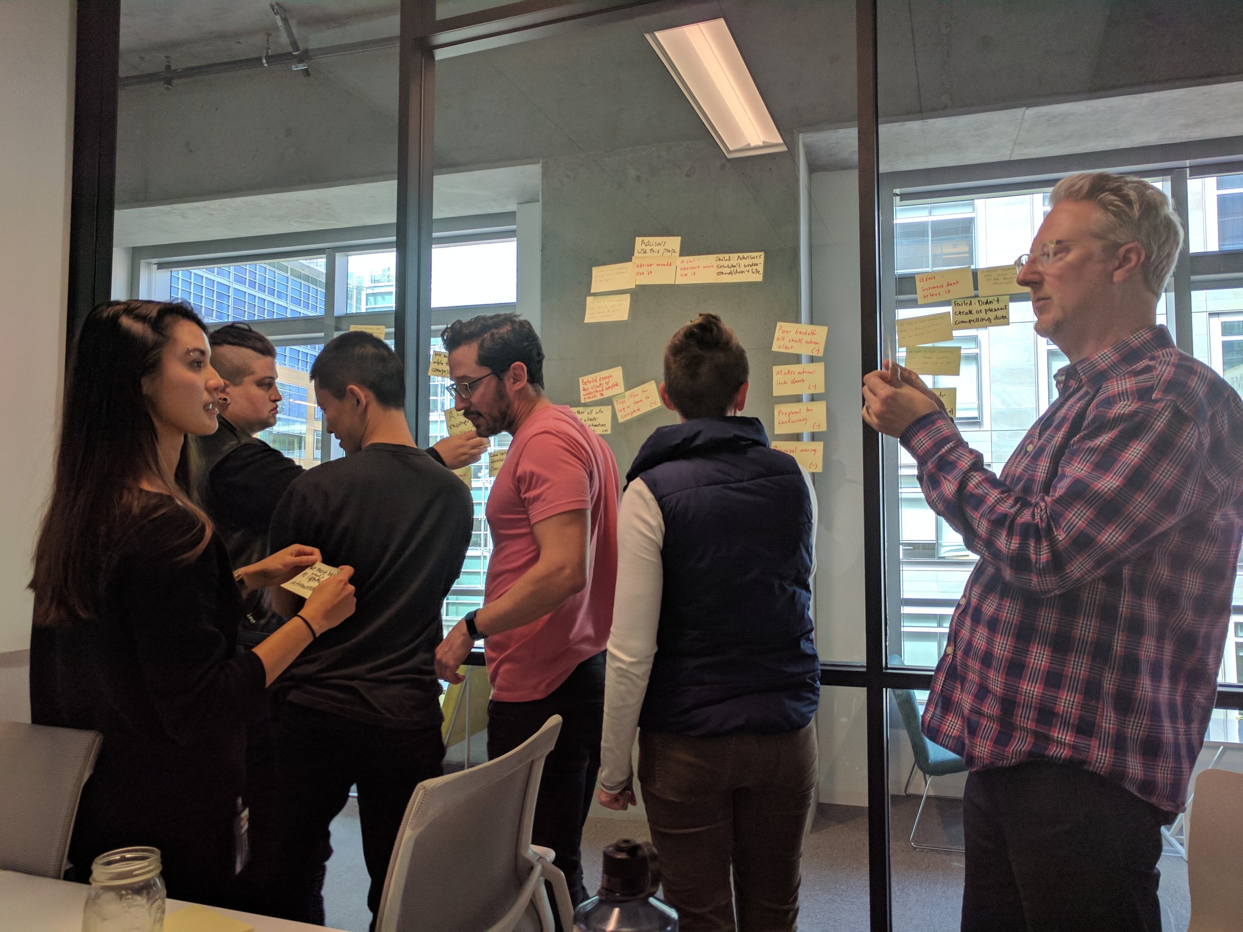
Foundational work
Our UX researcher, another designer, and I did some groundwork, including:
- Conducting user interviews to better understand the context
- Constructing design principles
- Creating a rubric to guide later design decisions
User interviews / Generative research
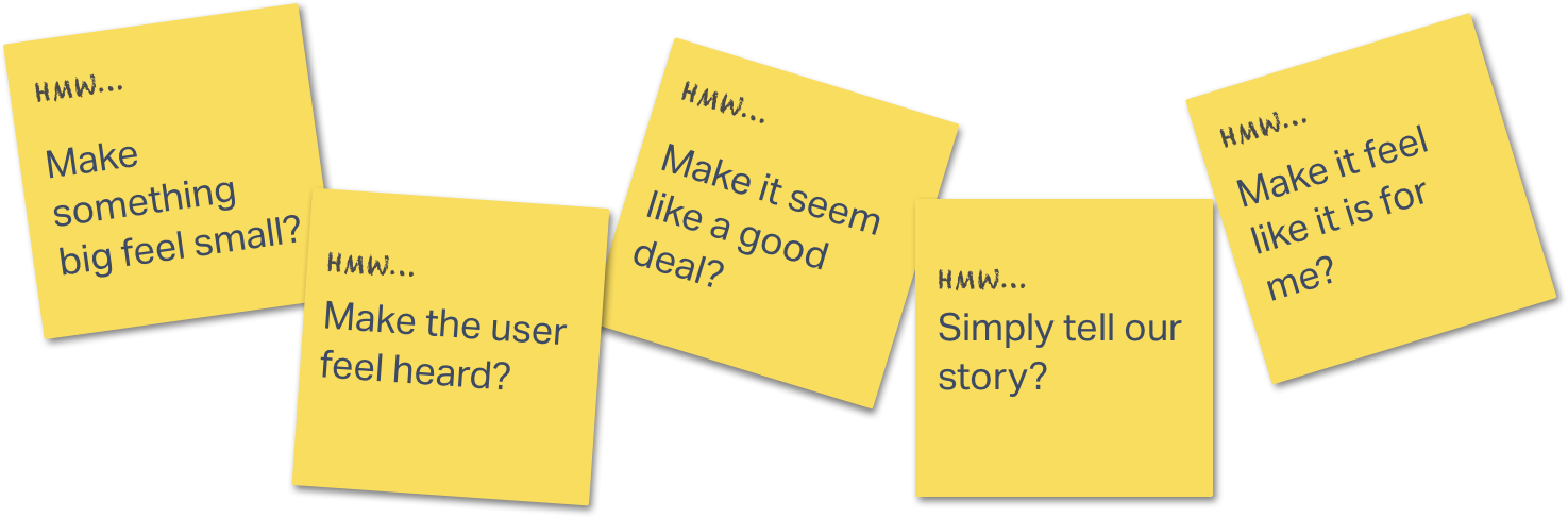
We interviewed people similar to our users to understand what happens in the "magic moment" that a client decides to invest. We saw trends in responses based on financial savviness:
How did it affect the design?

A user could get four "thumbs up" ratings on their current investments, which wouldn't be a great sell for us! But we knew we needed to be objective to win over clients.

Testers were relieved to see that they had an option to download the analysis and chew on the decision with a partner before moving forward.
Design principles
We use design principles to get stakeholder alignment on the tone, structure, and themes of a feature. They can also be helpful when making key design decisions.
How did it affect the design?
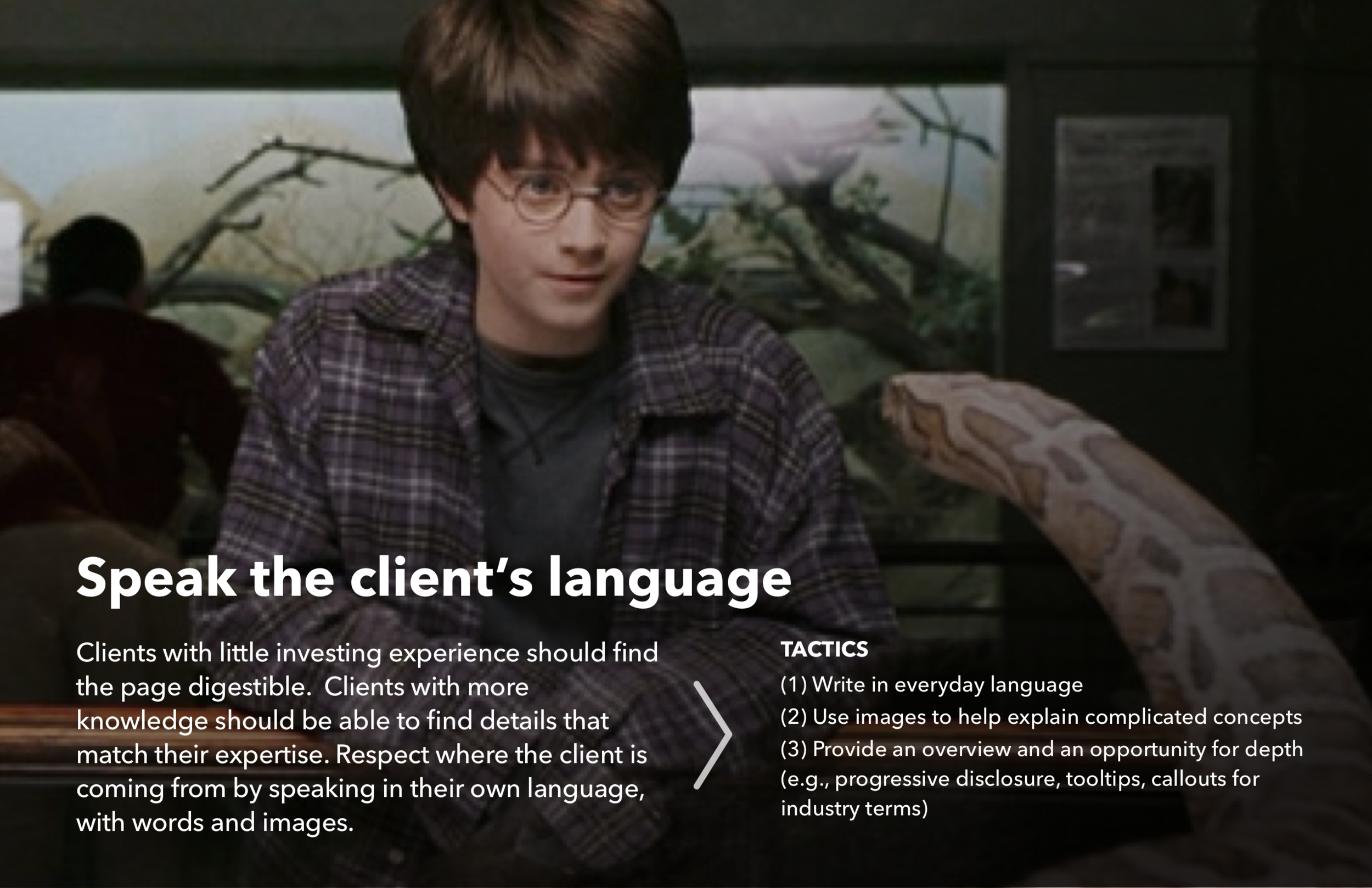
With a simple tone and jargon-free explanations, this copy was tailored to the user with less financial savviness.
Users with deeper financial knowledge can get more detail in "Learn more." We also display our expertise and give all users an opportunity to learn.
Design rubric
Rubrics articulate (1) a user's emotional state when arriving to the product and (2) the intended final emotional state. We use them to build empathy and to measure the effectiveness of a design in testing.

How did it affect the design?
Design execution, Round 1
Sketches, wireframe, and mockups, oh my!
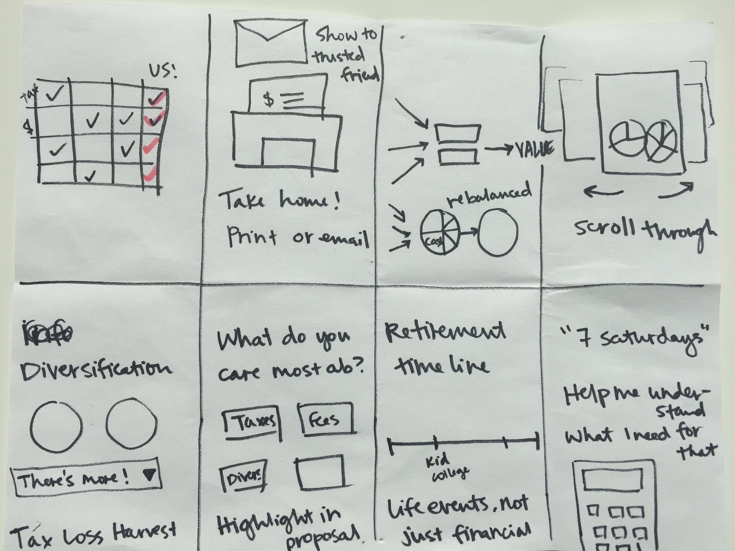
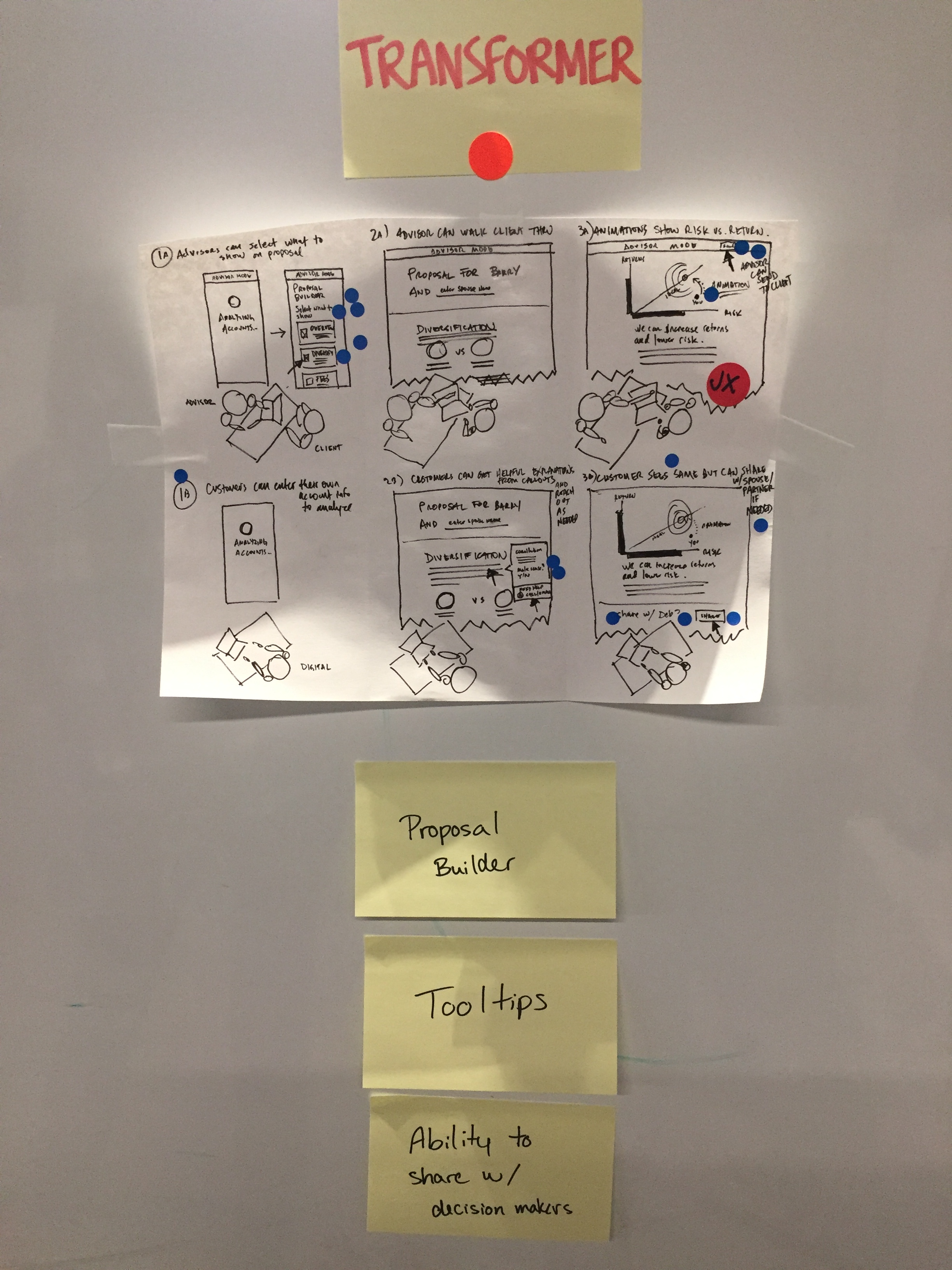
We started the design work with a core "investment health check-up" page (a concept from our design sprint). I drew the early sketch, and I pair designed with our visual designer on the hi-fi explorations.
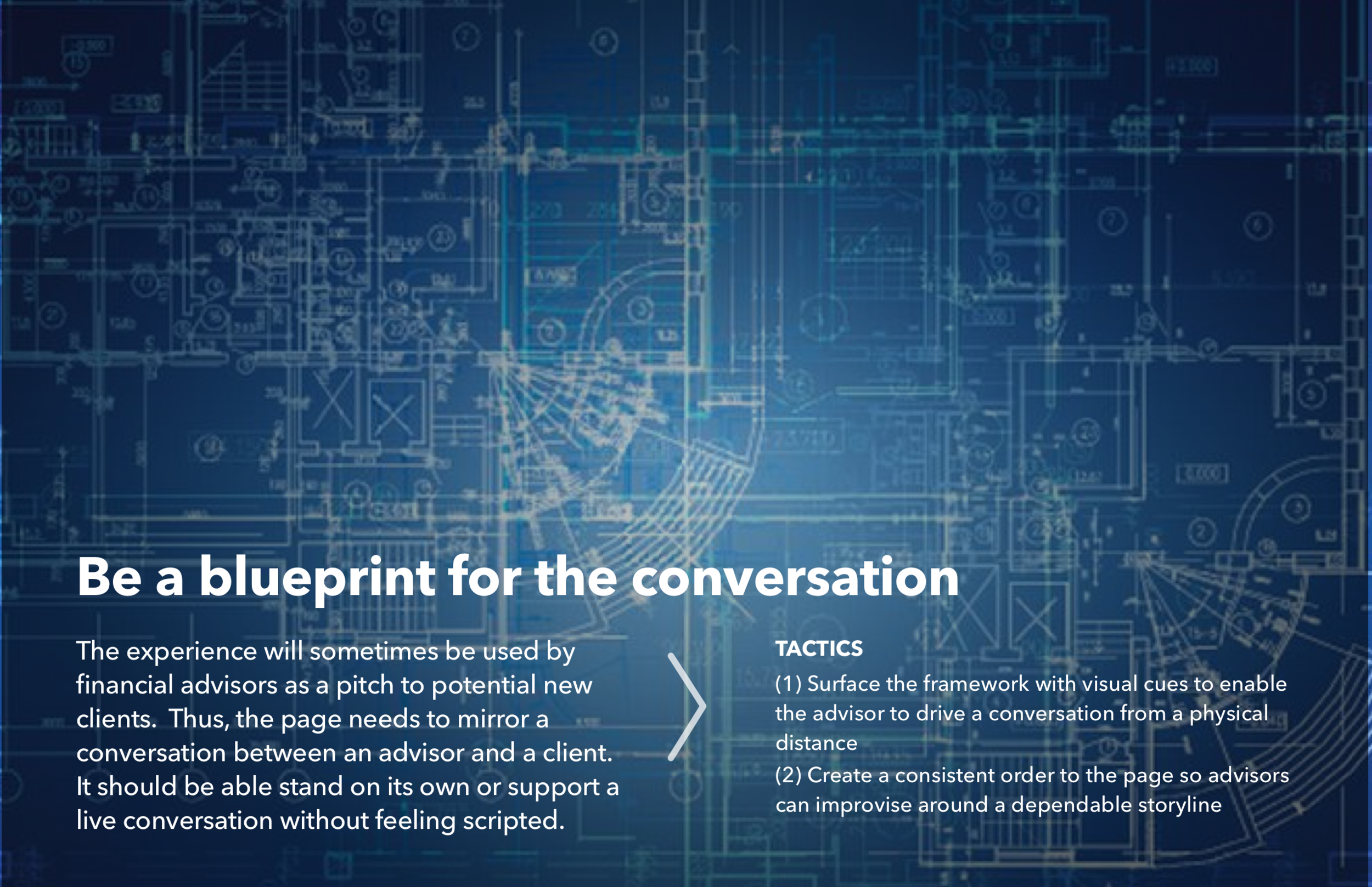
Getting the order right (with advice from financial advisors)
Our designs are meant to complement conversations that a financial advisor might have with a prospective client. We gave them a card sorting exercise and prompted them with:
- What order would you put these blocks if you were going to use it to pitch to a client?
- Is anything missing? Are there any aspects of your pitch that aren't represented here?
One of our in-house financial advisors sorts the modules we designed to represent how she pitches a client.

We asked advisors to make new cards if they noticed that some aspect of their pitch was not represented in our modules.
How did it affect the design?
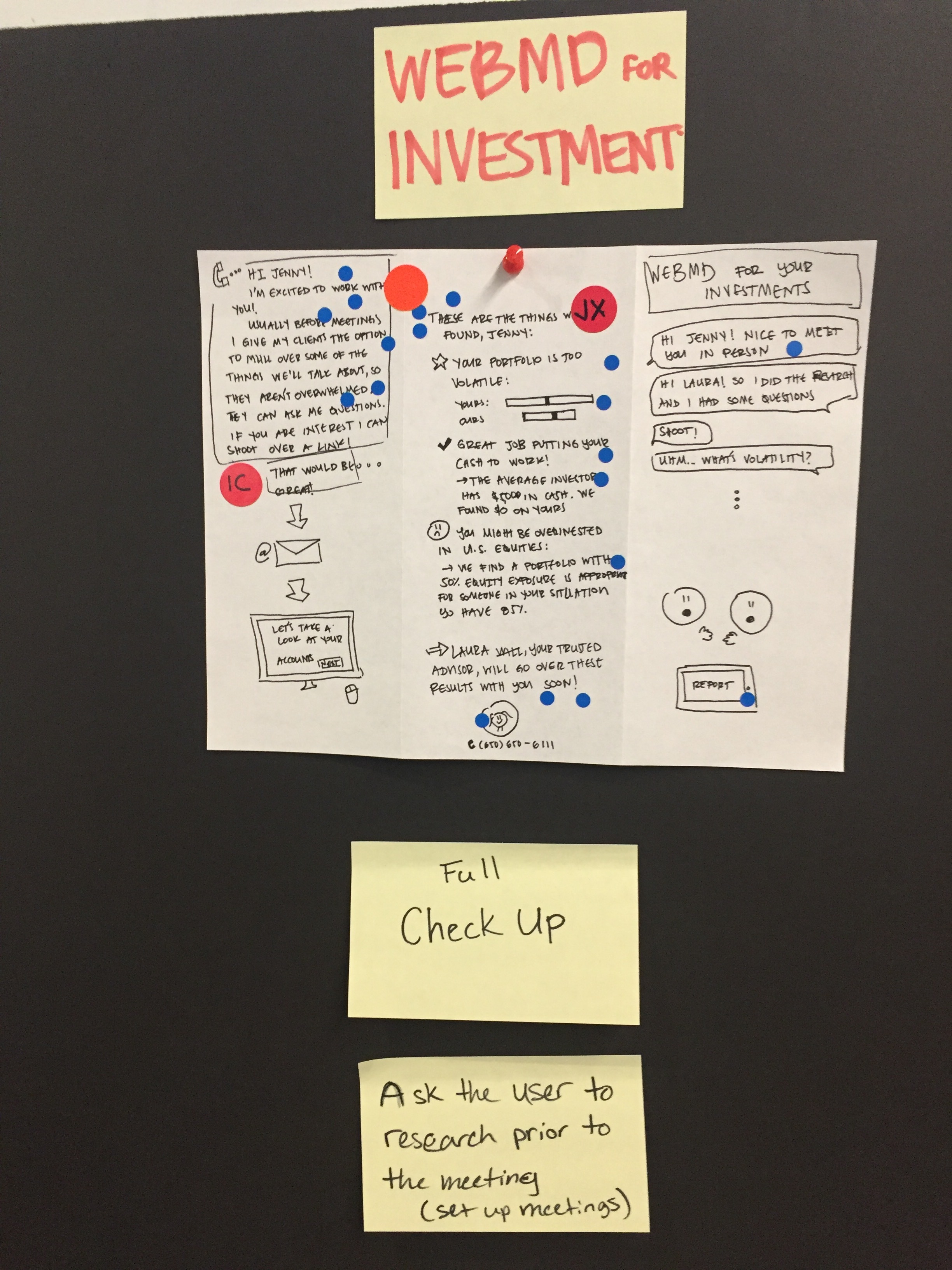
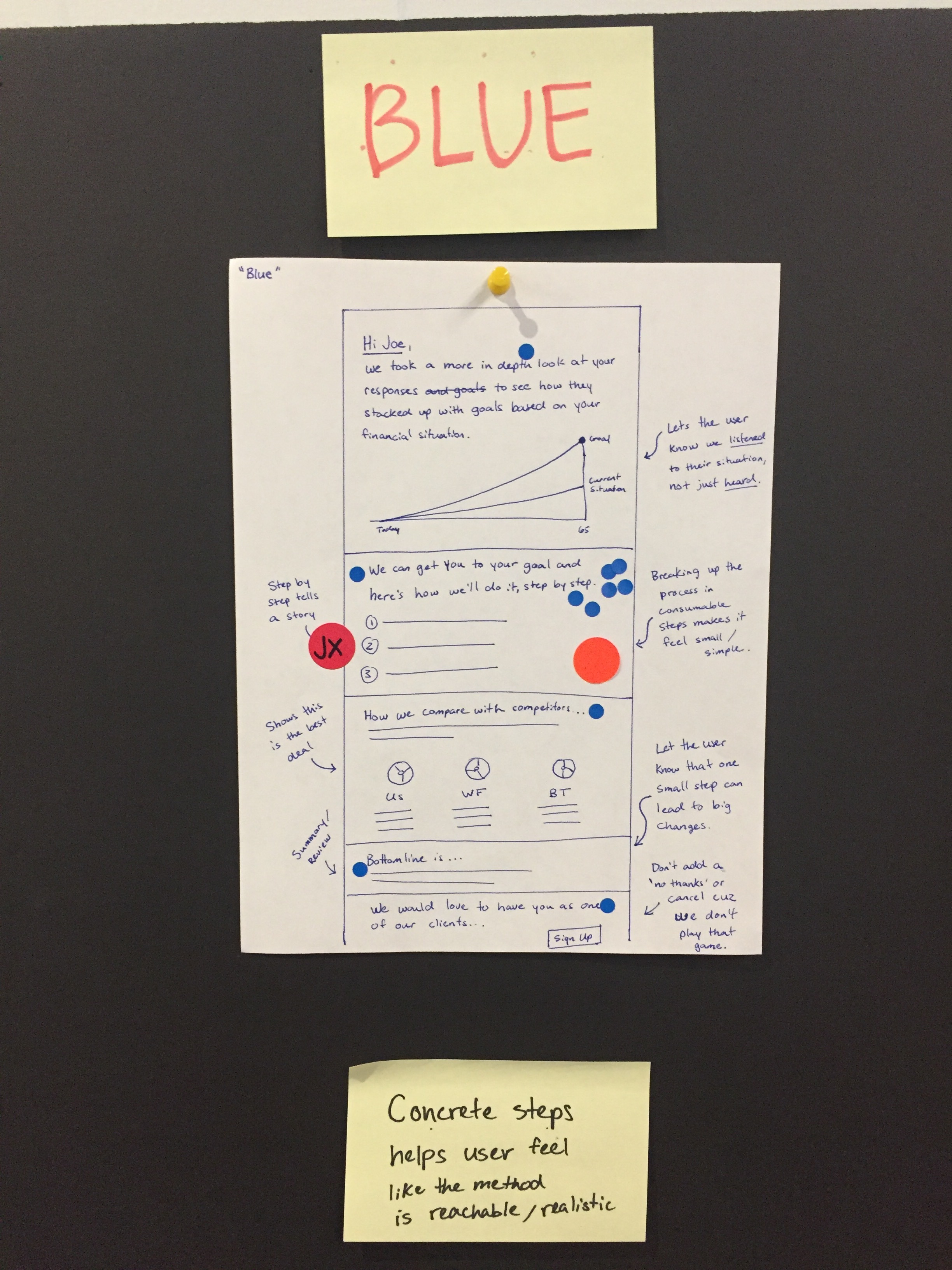
Design execution, Round 2
I worked with our visual designer, researcher, and content strategist to get the page polished and the copy crisp. Here's where we landed:

3. Design execution, Round 3
In this round, we fleshed out the flow leading up to the page we had designed. There were too many decisions to go through all of them here, but I've included a selection of some interesting ones.
Entry point: Fork-in-the-road VS Scenic detour
How should a user enter the investment analysis? We explored these two models in depth.
"Fork-in-the-road" poses an explicit question: Do you want to analyze your portfolio, or start investing? The "scenic detour" model assumes a primary path bypassing analysis, with the option to detour there.

The scenic route seemed like the obvious choice. We want users to breeze through onboarding quickly, right?
BUT some stakeholders argued that clients should stop to think deeply about this step. It's money, after all!
We eventually decided on the scenic detour, but only after much debate about our product philosophy, business values, and user needs. Design at its most fascinating!
Loading state: Working hard... or hardly working?
Running the analysis isn't lightning fast. We needed a loading state to keep the user engaged and convinced that we're doing hard work (because we are!).
There wasn't an easy way to get the back-end to tell the front-end what was happening at any given millisecond, so we fudged the timing and the stages to give users a sense of discrete progress.

I sat side-by-side with the dev who built the loading state until we got it just right. He still talks about how much fun it was to build!
4. Conclusions
Investing is complicated! And making it seem simple is tough business. I'm proud of our work, but every project has its faults. If I were to do it all over, this is what I would change:
Involve engineering earlier. We had a few cases where eng realities drastically affected UX. Had we known earlier, some design decisions could have been made earlier, with less swirl.
I would keep thinking how the analysis experience relates to the primary onboarding flow (scenic detour vs fork in the road). I'd like to dig into those options more, and test each with users.
Thanks for stopping by! Here's a screen grab of this feature in the wild:
