Strava | iOS Redesign
About Strava
Strava is a social networking app for athletes that allows users to track and analyze their performance while engaging in friendly competition.
The Challenge
To better understand Strava users, identify their pain points, and propose a redesign to improve the Strava user experience.
My Role: Designer
I performed user research and created the designs. I'm not affiliated with Strava. Just a power user who wanted to play with the product.
TL;DR
I love Strava! But I had usability issues with the app, and I wanted to explore the UX to see if others shared my pain. I performed 7 usability tests on the existing app, and based on my results, I re-designed screens for the "Record an Activity" and "Manually Upload an Activity" flows to improve comprehension and usability. Watch the magic below!
Design Process
Over the course of 3 weeks, I performed 7 usability tests to find user pain points, ideated possible design solutions, and then implemented those solutions in an interactive prototype.
1. Research: User Persona & Usability Tests
User Persona
I started the process by constructing a provisional persona to guide my assumptions and develop goal statements. This persona also informed my prioritization of proposed solutions.
Usability Tests
I tested several core features of Strava with 7 cyclists and runners with varying levels of familiarity with Strava.
I sourced users from a local running club and a weekly cycling group. I chose these two groups because they reflect a typical Strava user: the social athlete.
Results & Synthesis
Based on the results of the usability tests, I decided to focus my redesign on 2 pain points:
- Users struggled to save an activity after recording it, which is a primary function for tracking activities in Strava
- Users had trouble finding where to manually upload an activity, again a primary need to track activities in Strava
To get to that decision, I first identified each pain point users encountered in the tests. Then I mapped pain points by importance to Strava’s users and importance to Strava's business. I chose to tackle 2 pain points in the highest impact category (i.e., top right quadrant in the image below).
2. Ideate: Wireframes & Hi-Fi Designs
Wireframes
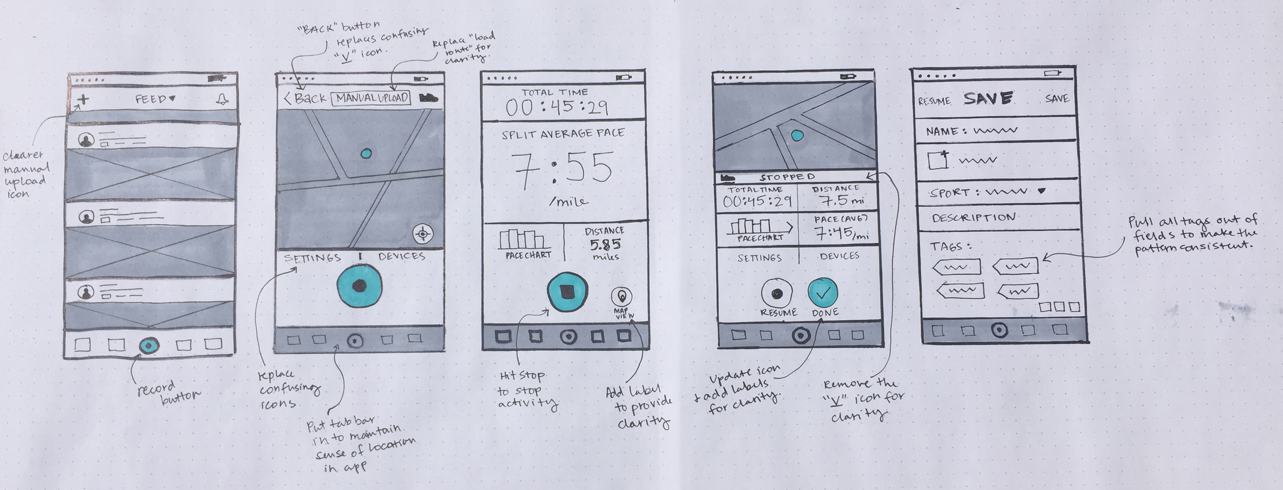
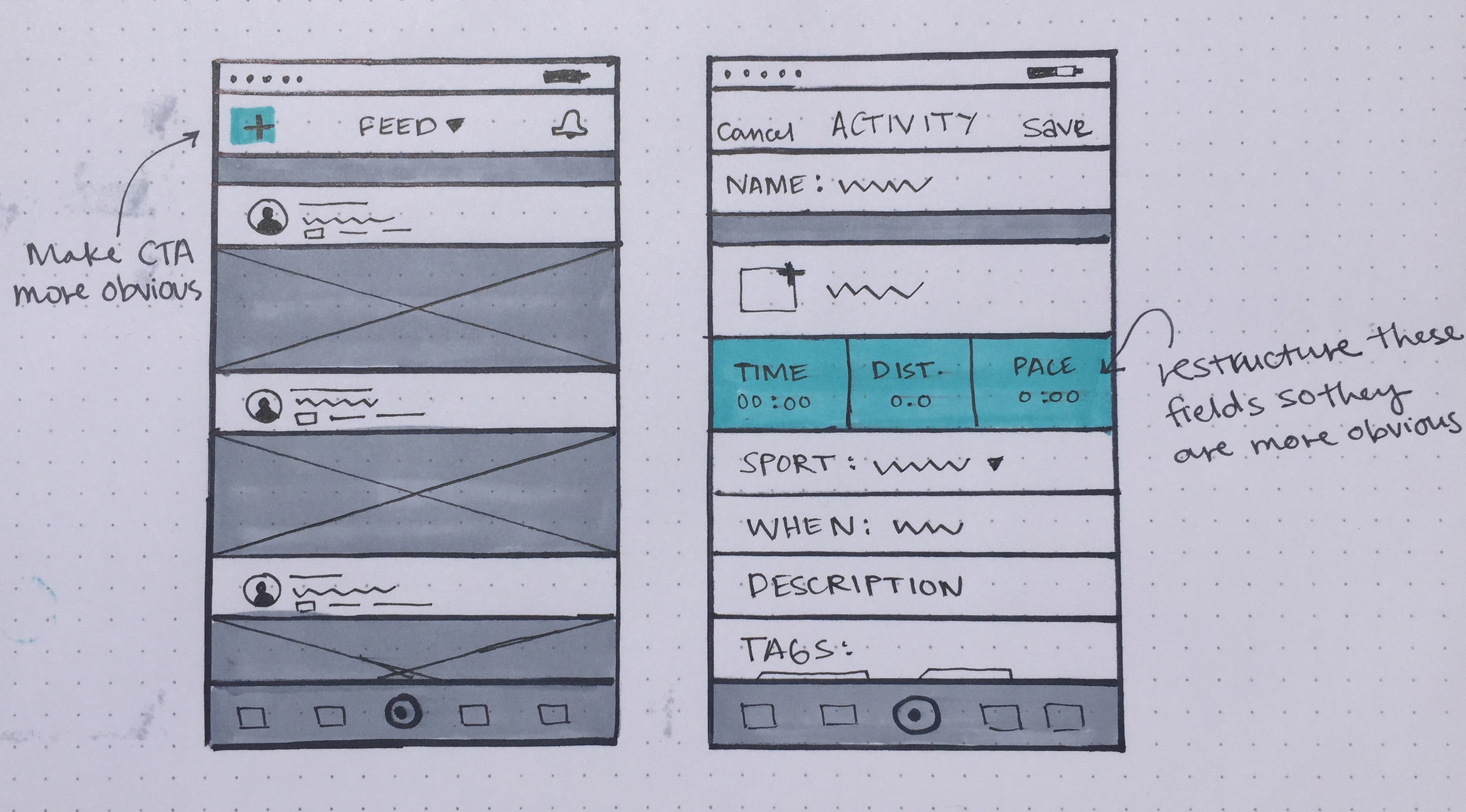
I translated my findings from the usability tests into paper sketches to refine my ideas and explore UI elements. I focused on two flows: (1) record an activity and (2) manually upload an activity.
Hi-Fi Designs
I translated my wireframes into high fidelity mock-ups that match Strava's existing style and brand.
"RECORD AN ACTIVITY" FLOW
"MANUALLY UPLOAD AN ACTIVITY" FLOW
3. Prototype
I used Flinto to prototype the interactions in the redesigned app. Watch the animation below!
Conclusion
This was an enlightening exercise in ripping apart an app that I use often (and love much). Putting it in front of users, some familiar with Strava and others less so, revealed major pain points in core features of the app. It took some thinking (and lots of coffee) to find them, but there are several design updates that Strava can make to improve usability, thus allowing athletes to focus on their sport, not on their phones. Thanks for reading!


