
Hipcamp | Designing for Growth

About Hipcamp
Hipcamp allows users to search and book campsites across the U.S. It functions like an "Airbnb for camping," where land owners can list their land on Hipcamp, and campers can reserve campsites through the site.
The Challenge
Hipcamp found that their users tend to book campsites for groups of +4 people, most of whom are not registered users. Hipcamp challenged us to design a feature that would incentivize those campers to join Hipcamp.
My Role: Designer
I was on a team of 2 designers; we shared responsibilities for persona development, lo-fi to hi-fi design, prototyping, and usability testing. We collaborated with 5 growth marketers to define the scope of the project.
“Stefanie was such a pleasure to work with. From ideation of the feature down to a working prototype, she nailed it. She was able to take lead and hit requirements with very little direction. I’m looking forward for a chance to work with Stefanie again!”
TL;DR
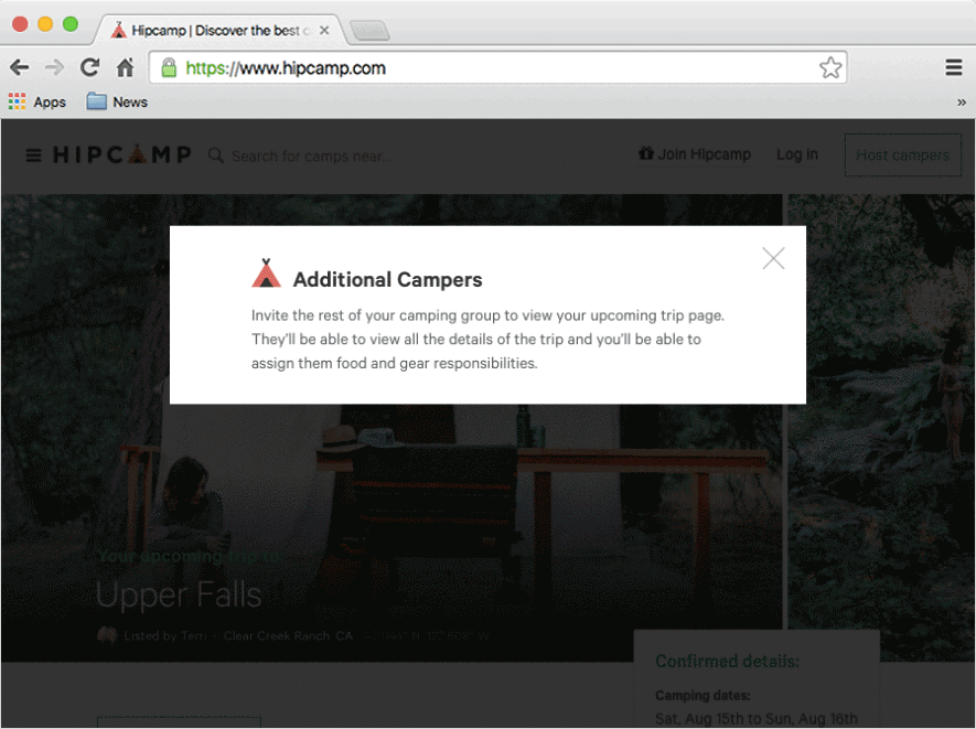
Hipcamp challenged us to design a feature to incentivize unregistered campers to join Hipcamp, enabling viral growth and providing value to users. We delivered a feature that allows Hipcamp users to:
- Invite fellow campers to an existing “upcoming trip” page,
- Create a list of food and gear for the trip, and
- Assign the items to their fellow campers to bring on the trip.
Click around on our final prototype HERE, or watch the magic below:
Design Process
We used Stanford/IDEO's design thinking framework as a loose guide to structure our 4-week sprint (illustrated below).
In the first week, we collaborated with 5 growth marketers to brainstorm and select a feature. In the remaining 3 weeks, the designers ideated, prototyped, and tested the feature. This case study details each stage of this design process.
1. Empathize: Creating Personas
We identified two types of users for the new feature: Rob (Registered Hipcamp User/Trip Planner) and Michelle (Unregistered Camper). These personas helped us make decisions on which features to design, prioritize side features, and choose who to test the prototype with.

2. Define: Feature Selection & Task Flows
Collaborating with Growth Marketing Team
While we (the design team) were getting to know Hipcamp users better, the growth team was simultaneously digging into Hipcamp's business needs and exploring data from the existing Hipcamp website. The two teams separately brainstormed possible features to propose to the client, then we converged to select one. The three feature options we considered were:

We ultimately selected Option 2: Camper list and food/gear recommendations due to (1) business impact, (2) value to the user, and (3) client preference.
Mapping Task Flow & Pain Points
After selecting the feature, we mapped a task flow to identify tasks that Hipcamp could streamline. This flow shows tasks people face when preparing for a camping trip. Red boxes are pain points (i.e., design opportunities!).
3. Ideate: Sketching, Wireframing, and Iterating
Sketching & Wireframing
We began UI ideation with several rounds of Crazy 8s, using zen voting to hone in on our best options. Once we agreed on a few core design elements, we produced a set of mobile lo-fi wireframes.

Iterating on Concepts
While designing the wireframes, we decided to use modals for editing the camper list or the food/gear list. The pattern seemed like a good way to simplify the experience, but as we built the designs, it dawned on us: something wasn't working! The design didn't scale well on mobile, and the modals took users out of the context of the rest of the site. So we scrapped the modals and moved the edit functions in-line. Check out the results:

4. Prototype: Hi-Fidelity Screens & Interactions
Designing Hi-fi Screens
We applied the Hipcamp branding and style to our lo-fi wireframes. While we did not have a complete style guide to work from, we used the existing Hipcamp "Trip Confirmation Page" for context, and we worked with Hipcamp's lead designer to maintain brand consistency.

Prototyping Interactions
We used Marvel to prototype interactions on desktop to use in usability testing with users. Our final prototype shows these interactions.
5. Validate: Usability Testing & Rapid Iteration
We conducted usability tests to put our designs to the test with real users. We asked users to perform 8 tasks using our prototype, and we took note of comprehension or usability issues that users had. We then iterated on our designs based on the results.
Initial Usability Testing
After 2 usability tests, it was clear that users had trouble understanding one of our proposed features (the ability for users to check off gear they had packed). Users were opting to send a message to the camping group to let them know they had packed their gear instead of checking it off.

Usability tests were conducted on people who fit into one of the two persona types discussed previously.
Rapid Iteration
Given our short timeframe, we cut the confusing feature and included it as a recommendation for future design. We rapidly redesigned without the feature and tested our new prototype on 6 participants. After iterating, we had 100% comprehension on the previously failing task. Win!

Usability Test Results & Findings
Following the iteration, users understood and successfully used most of the primary functions. Users seemed excited to try it out on their own camping trips! Here are some of the findings from our tests, grouped into two categories: (1) strengths and (2) opportunities for improvement.

Final Deliverable
Based on our usability results, we made minor visual updates before delivering the designs. We delivered desktop and mobile mockups and a clickable prototype for desktop.
Conclusion
Hipcamp challenged us to design a feature to incentivize unregistered campers to join Hipcamp, enabling viral growth and providing value to users. We delivered a feature that allows Hipcamp users to:
- Invite fellow campers to an existing “upcoming trip” page,
- Create a list of food and gear for the trip, and
- Assign the items to their fellow campers to bring on the trip.
Users responded well to the feature, and the client loved it! The Hipcamp team is building this feature on their site now.
Testimonial
“Stefanie was such a pleasure to work with. From ideation of the feature down to a working prototype, she nailed it. She was able to take lead and hit requirements with very little direction. I’m looking forward for a chance to work with Stefanie again!”